writing
The CIA was "Probably" Right
Apr 2026
In 1951, the CIA warned that a Soviet invasion of Yugoslavia was a
Kent asked the people who had approved the phrase what number they had in mind. Their answers ran from 20% to 80%. In 1964 he proposed a standard scale for phrases like “probable” and “almost certain.”1 The CIA ignored it.
In the 1970s, researchers at Decisions and Designs, Inc. tested Kent’s concern with 23 NATO intelligence officers.2 They asked each officer to translate phrases like “It is
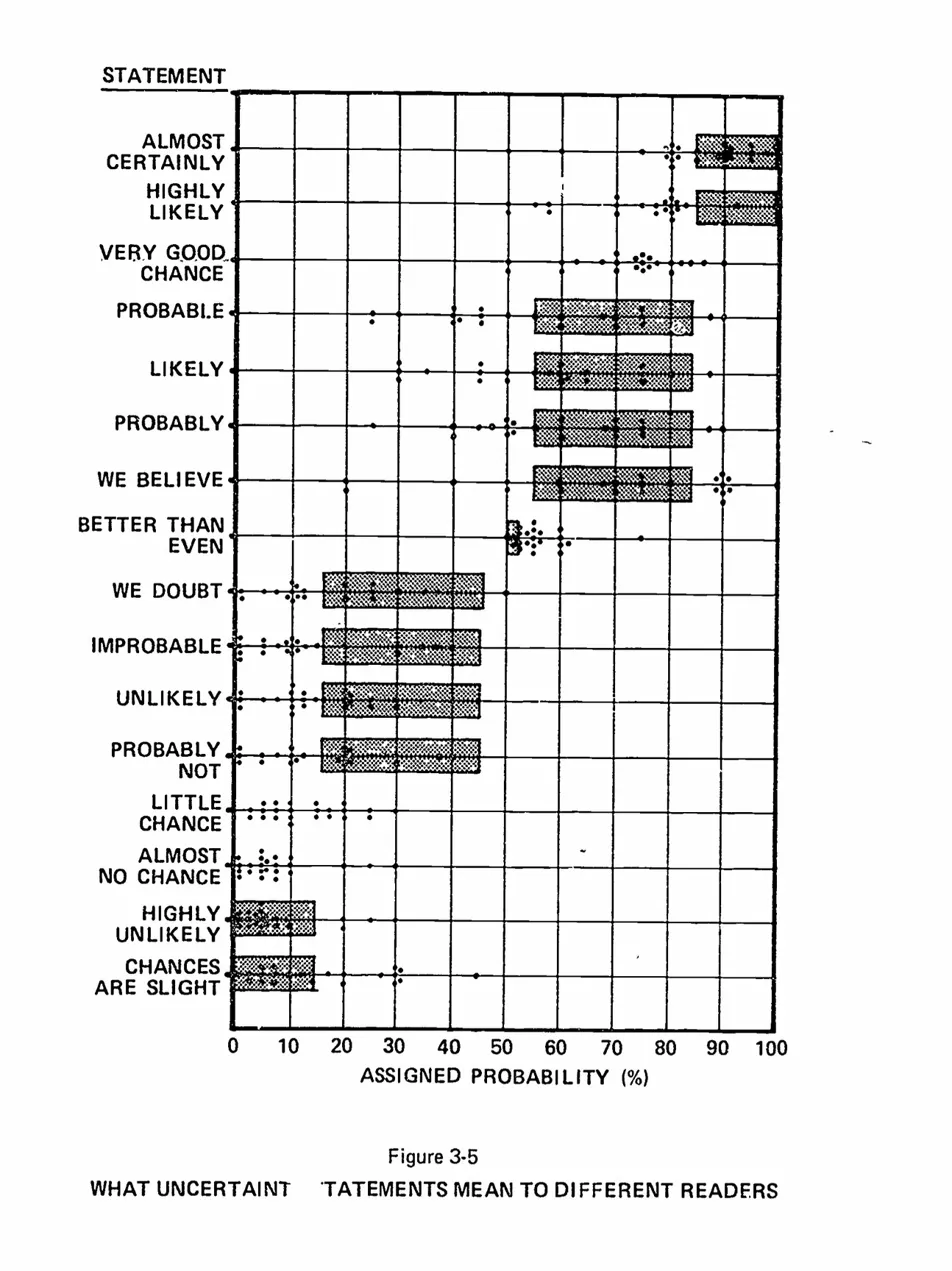
Barclay et al. (1977). The dots are individual officer responses; the shaded bars are Kent’s proposed ranges. The crosshatching makes dots hard to count.
That chart went everywhere. Richards Heuer’s Psychology of Intelligence Analysis; foundational CIA text. Pherson and Pherson’s Critical Thinking for Strategic Intelligence; standard university textbook. Risk management handbooks. Defence Department training materials. Hundreds of blog posts, conference slides, and LinkedIn thought pieces. If you’ve ever encountered the argument that verbal probability language is dangerously ambiguous, you have almost certainly seen some version of this chart.
Two charts walk into a bar
I noticed the problem by accident. I was comparing the 1977 Barclay original with a 2013 redrawing from the Pherson textbook. Same data, supposedly. Same 23 officers, same 16 phrases, same dots on the same axis.
Except “We Believe” looked completely different.
So I did the obvious thing: I checked. I digitised three published versions of the chart — Barclay (1977), Heuer (1999), and Pherson (2013) — and recorded every dot position.3
“We Believe” is the worst case, but the problem is everywhere. The number of dots per statement varies from 16 to 23 across the three versions. It should always be 23. The dots sit on top of Kent’s shaded ranges, so readers lost some and invented others.
I was not the first to catch it. Edmund Conrow audited the chart in 2010 and found worse: the raw data had been lost, so every later version came from someone reading dots off a graphic.4 Ten of the twelve shaded Kent ranges were wrong, and one bar, “highly unlikely,” should not have been there at all.
So was Kent actually right?
The chart is broken. But the claim it supports — that people disagree about what probability words mean — might still be true.
A broken thermometer doesn’t mean the room isn’t hot.
To find out, I ran a new survey. I showed 99 English-speaking respondents with undergraduate or higher education 25 probability phrases in random order.5 The original 16 from Barclay plus nine more, including “frequent,” “realistic possibility,” “rare,” and “occasional.” No scenario. Just phrases and a slider.6
Zonination had already done something similar in 2015 on /r/samplesize, with 46 respondents and 17 phrases.7 That makes three independent samples: NATO officers in the 1970s, Reddit in 2015, mine in 2026. Three chances for the pattern to fall apart.
The headline: Kent was right. He’s been right for fifty years.
| Phrase | NATO officers, 1970s | Zonination, 2015 | Hails, 20268 |
|---|---|---|---|
| Almost Certainly | ~85 | ~90 | ~90 |
| Probable | ~70 | ~70 | ~70 |
| Likely | ~75 | ~70 | ~75 |
| We Believe | ~70 | ~70 | ~70 |
| About Even | ~50 | ~50 | ~50 |
| Probably Not | ~20 | ~30 | ~20 |
| Unlikely | ~15 | ~20 | ~15 |
“Probable” has meant about 70% for half a century. NATO officers, Zonination’s respondents, and mine all land on roughly the same number. Whatever people think “probable” means, they have meant it with surprising consistency since the Cold War.
The survey presented phrases in random order, so that hierarchy is not a framing effect. People still rebuild the same ladder from “certain” down to “impossible.”
But the spread Kent worried about is still there.
“About Even” is easy; the phrase carries its own number. Everyone puts it at 50%, give or take a couple of points. “Coin Flip,” which I included as a control, lands at 50% with almost no spread.
“We Believe” is different. Put ten people in a room and ask what it means; the gap between the most confident and least confident is about 40 percentage points. That is the width of an entire Kent category. It is as though you asked ten people how far London is from Edinburgh and got answers from Brighton to Inverness.
“Realistic Possibility” is just as bad. “Highly Unlikely” is worse. One reader’s “highly unlikely” is another reader’s “about even.”
Those extreme dots are not obvious junk. The phrases arrived in random order, the responses passed the attention filters, and most still follow the same broad hierarchy. People are not clicking at random. They are reading the same words and mapping them to different numbers.
The spread is lopsided, too: “Highly Likely” fits under one hand on the number line; “Highly Unlikely” needs an arm.
That asymmetry is the wrong way round for intelligence analysis, where the hardest calls are often about low-probability, high-impact events. “It is highly unlikely that the adversary will deploy this capability” is exactly the sort of sentence where everyone should hear the same number. They do not. One reader hears a remote risk. Another hears something close to one in three. That is the difference between ignoring a threat and scrambling a response.
What broke
This chart is a small lesson in how evidence decays.
Kent identified a real problem in 1951. Researchers gathered real data in the 1970s, then trapped it in a hard-to-read graphic instead of a table.9 The chart was useful, so people kept copying it, and each copy made it a little worse.
The conclusion survived the damage. Five decades and four independent datasets still show that the ambiguity is real. The striking thing is not that people disagree, but that they disagree in such a regular way.
Across fifty years, different groups have put phrases like “probable” and “unlikely” in almost the same part of the number line. The hierarchy survives. On average, the language is far more stable than the broken chart suggests. That is also what makes the problem easy to miss. The averages look tidy; the order feels natural. But decisions are not made by average readers. They are made by one person writing “unlikely” and another person reading it, and at that level the phrase can still cover far too much ground.
That is the limit of verbal probability language. It preserves the ranking, but not the quantity. In casual conversation that is often good enough. In intelligence estimates, risk registers, consent forms, and anything else someone may have to act on, it is not. Most of the world still writes as though the words alone will do.
So Kent was right about the remedy, even if his preferred words were not enough on their own. When the number matters, write the number. Better still, write the range; if you can justify it, write the confidence interval.
Footnotes
-
Sherman Kent, now declassified, “Words of Estimative Probability” (1964). The CIA did not adopt his scale.
Kent’s own account points to several reasons: many thought the numerical mapping was too sharp for the underlying evidence, and a fixed vocabulary would impose what he called “intolerable restraints upon the prose.”
The deeper problem may have been that vagueness was useful: once words are tied to ranges, an estimate becomes much clearer, and much easier to judge later. ↩
-
Ranging from Squadron Leader to Lieutenant General, people whose literal job was reading probability language in intelligence reports. ↩
-
Dot coordinates were extracted from scanned images of each publication. NATO officer medians are estimated from the Barclay digitisation and should be treated as approximate given the grid distortion documented by Conrow (2010). The Zonination 2015 data is from their publicly available GitHub repository (n=46). ↩
-
Edmund Conrow, “Evaluation of Subjective Probability Statements,” AIAA Space 2010 Conference, doi:10.2514/6.2010-8739. ↩
-
Recruited via Prolific (n=99, English-speaking, undergraduate education or higher). Phrases were presented in randomised order as bare words with a slider response; respondents who failed control questions or produced incoherent/low-effort responses were filtered out. Three control items (coin flip, birthday, lightning) were included but excluded from analysis. ↩
-
If you want to see where you land, the survey is still open. It takes about three minutes. ↩
-
The resulting joyplot visualisation won an Information is Beautiful award, which means it has now joined the long chain of reproductions of Kent’s original idea. ↩
-
Medians rounded to the nearest 5. With interquartile ranges of 10—20 points for most phrases, reporting to the nearest integer would be false precision. ↩
-
It also contained grid distortions in the shading, which caused different readers to lose or invent dots when manually transcribing the data. ↩